Case Study 1
This case study explores the development of an application called SOLR SYSTM designed for people who recently moved to a new place (re)establish social connections through discovering local events/venues and finding people with shared interests to better acclimate themselves to their new environment.
my role :
Solo UX/UI Designer, Research, Ideation, Wireframes, Low Fidelity design, High Fidelity Design, Prototyping, Usability Testing.
Completed at DesignLab UX/UI Bootcamp
WEAKNESSES
1. DISCOVER
Research | User Interviews | Competitive Analysis | User Personas
What I did :
1. Secondary research
2. Primary research
3. Processing & analyzing the data
4. User personas, User flow, Sketching and prototyping
5. Low-fidelity and high-fidelity design and prototyping
6. User testing
Learnings
Motivation to connect and seek out social connections was centered around finding like-minded people and creating new friendships.
Anxiety and fear of rejection were main emotional responses by participants about adjusting to the new place.
All participants use social media to find/locate events and connect with people.
Pain Points
Time management with job or school work
Transportation/commute
Personal fears
Cost of living/financial status
COMPETITOR ANALYSIS
We looked at three competitor’s products and strategies, identifying gaps, opportunities, patterns, and trends.
OVERVIEW
Group activities
Making option available to non-FB users
TARGET USERS
Faceboook events
Events is a Facebook tool that allows users and business pages to create dedicated landing pages for their events. Guests can learn more, RSVP, and interact with your brand and other guests
Local events by community and businesses
Only focus on one specific niche
bumbl e bff
BFF is a feature on Bumble which when switched on, logs you out of the dating mode & connects you with users who just wanna be friends.
STRENGTHS
One-on-one connections
Not expanding their focus outside 1-on-1
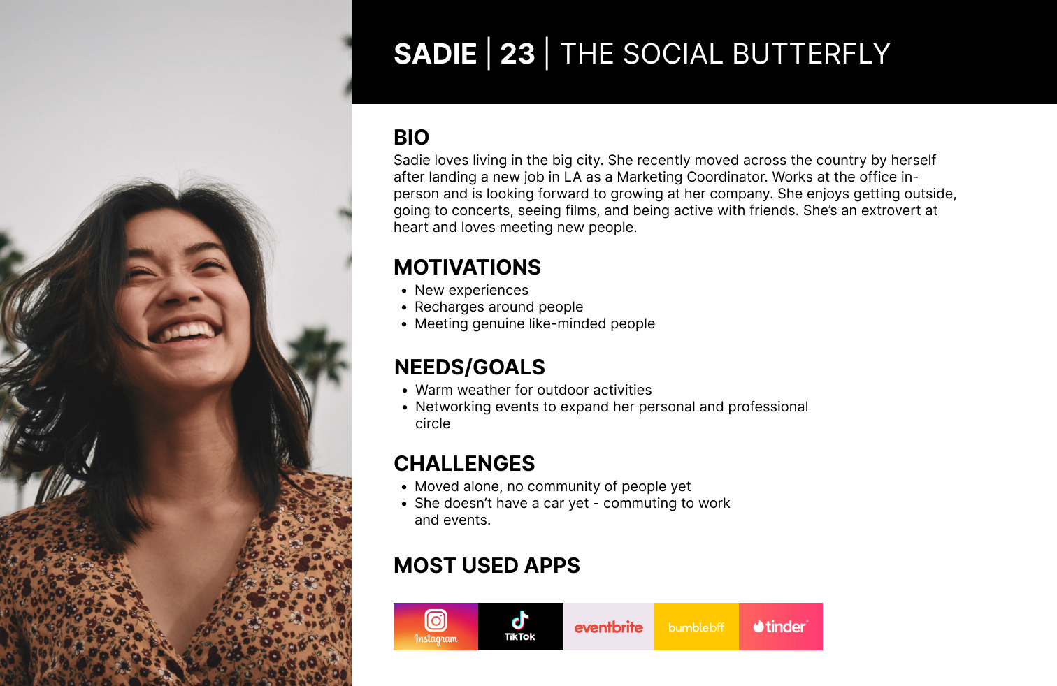
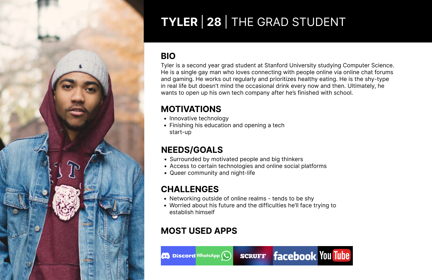
USER PERSONAS
We developed two user personas to illustrate our participants' characteristics and identify their core needs and frustrations. Here are a few examples:
HOW MIGHT WE…
Ideation/ prioritization
2. DEFINE
POVs & HMWs | Ideation | Prioritization
My research and personas led to one question that would inform ideation and creation of the solution, keeping the user top of mind:
How might we streamline the process for new movers to locate and find events to help them integrate into their new place swiftly?
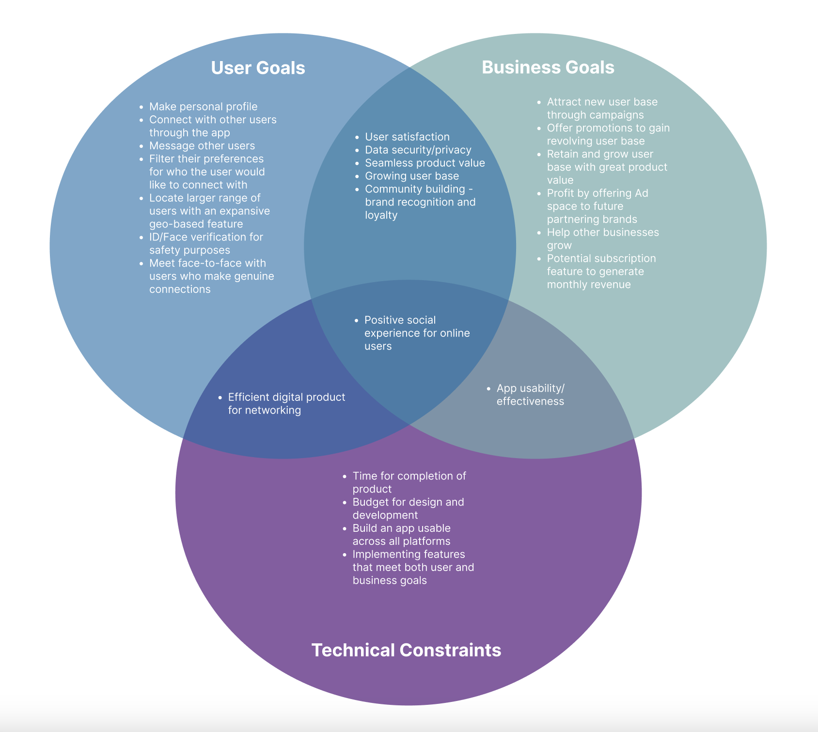
I began with identifying both business and user goals to determine overlap so that I could ensure my solution included both.
Taking the user needs and interests uncovered during the previous phase, I created a product feature roadmap to outline and prioritize my ideas. This ensured I focused on the highest priority features that aligned with user needs and business goals to produce an incredible product; while taking note of what could be added later to future releases.
RESEARCH:
The aim was to understand the strategies movers use to establish new social circles and how they learn about/locate events happening in their new area; And how best to make these experiences more enjoyable, efficient, and timely so it will benefit their experience.
OBJECTIVES
Determine the challenges of social and personal integration when moving to a new place.
Examine the certain strategies a person uses to best integrate in a new place.
Understand how technology plays a role in social connection and facilitating a new community of people.
METHODOLOGIES/FINDINGS
USER INTERVIEWS
Five participants were interviewed one-on-one and remotely through video/phone calls. Each participant has recently moved to a new place within the past five years.
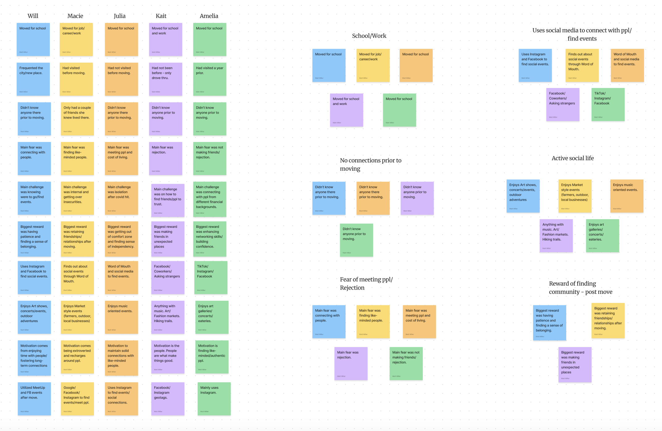
AFFINITY MAPPING BASED ON INTERVIEWS
Themes/Headlines
People relocated/moved for either school or work purposes
The majority didn’t know anyone before arriving
Fear of rejection/finding people to connect with seemed the most dominant fear.
Participants gained a sense of belonging/self-confidence after arriving by stepping out of their comfort zone.
All participants are socially active people who enjoy interacting with the community around them.
Meet up
Meet up is where you can connect with new people, learn new things, find support, get out of their comfort zones, and pursue their passions, together.
Prioritization resulted in a clear feature set to begin designing.
MUST HAVE FEATURES
Event Matcher - Matches/ranks you to events happening in the area for the month based on the information provided in the user profile
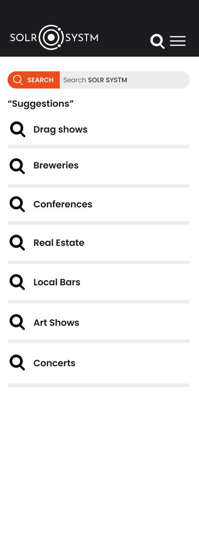
Search/Discover Page - Explore/Discover page to find other userSearch bar to find look up events/venues, other users, communities, online/offline status
Attendee Interaction/interest indicator - Send personal virtual invites/messages to users you'd like to go to an event/venue with and a page to see which users are attending or showing interest in an event.
User Account - User registration, sign-in, and account page so the user can access all their relevant and specific data such as previous purchases. personalized settings to secure user profiles and keep the app safe from certain breaches. Face ID
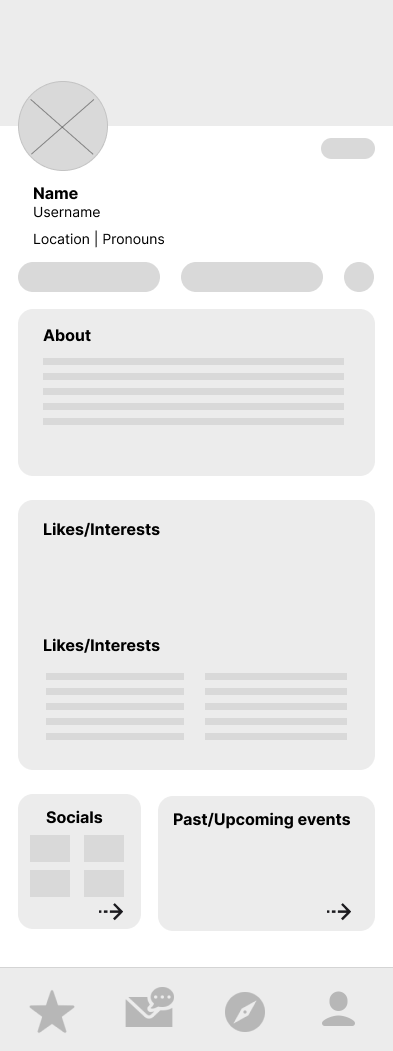
Personal Profile - Personalizing user account, adding all interests, personality quirks, likes/dislikes, etc.
3. DEvelop
Information Architecture | Sitemap | Wireframes | UI Design
SITE MAPPING - USER FLOWS
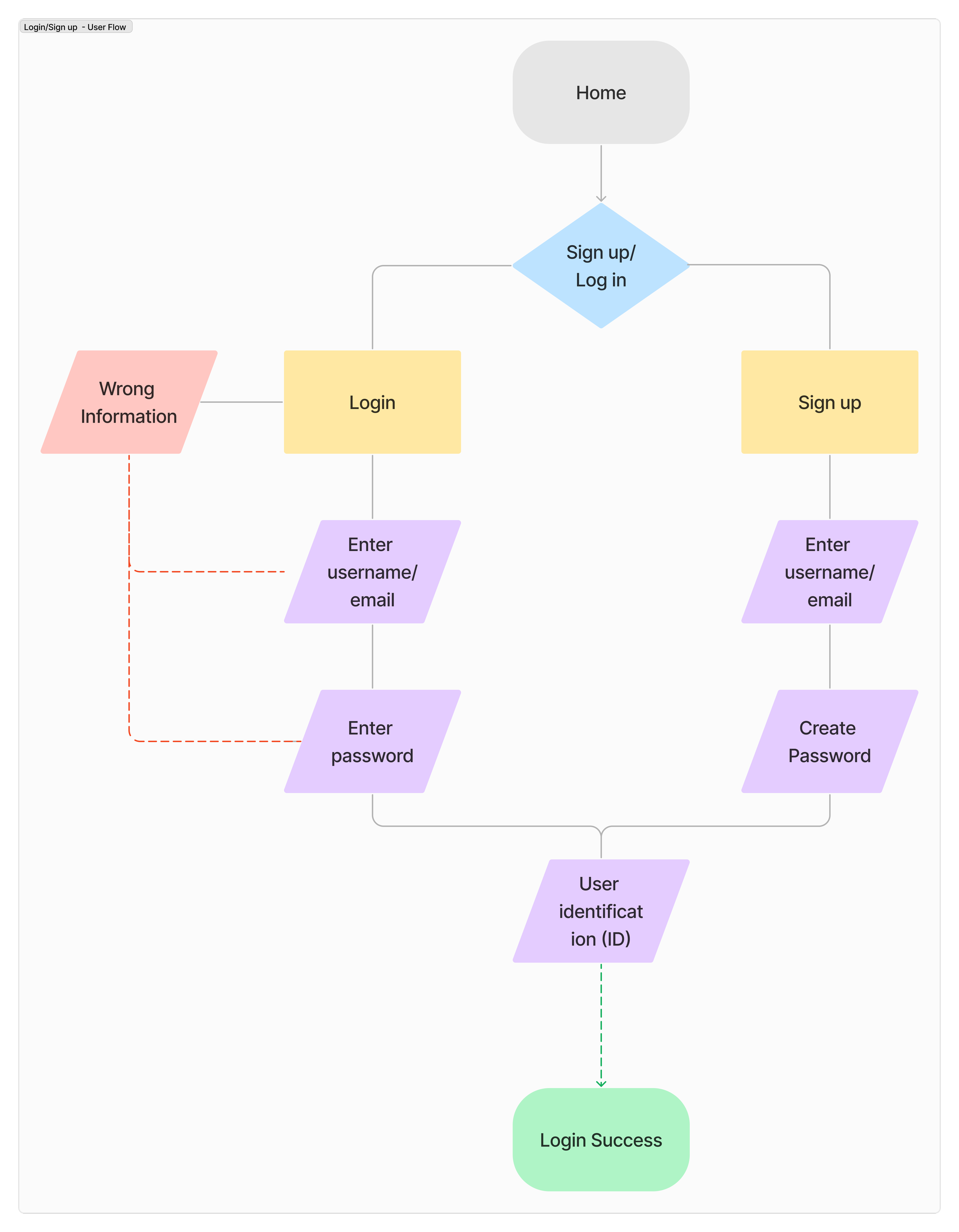
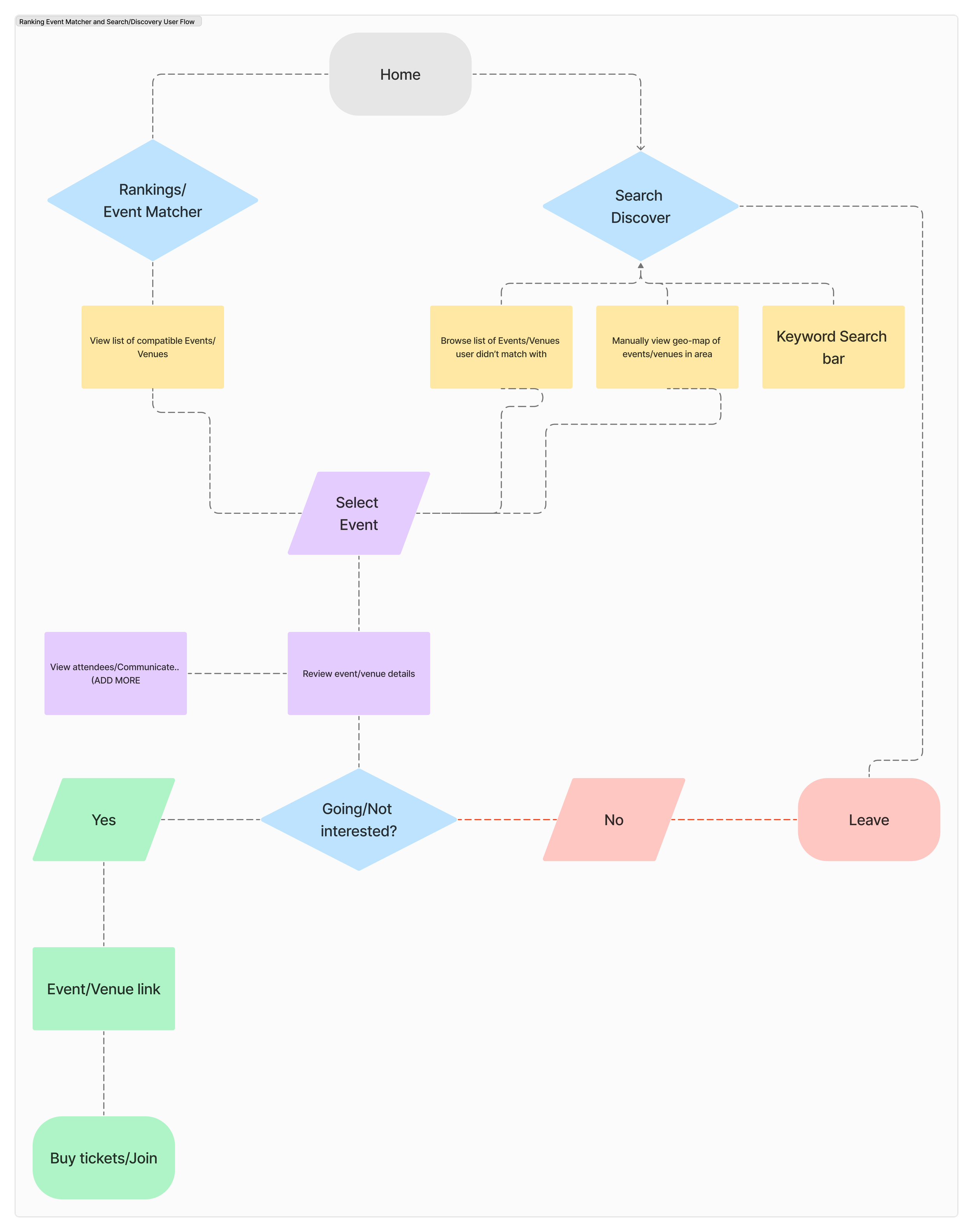
Then we created three user flows: Login/Sign up, Ranking/Event Matcher, and Search/Discovery.
The Ranking/Matcher consists of a personalized top 10 list of events that is tailored to the likes and interests of the user.
The Search/Discover allows users to manually search for an event of their choosing.
LOGIN/SIGN-UP
EVENT MATCHER & SEARCH/DISCOVERY
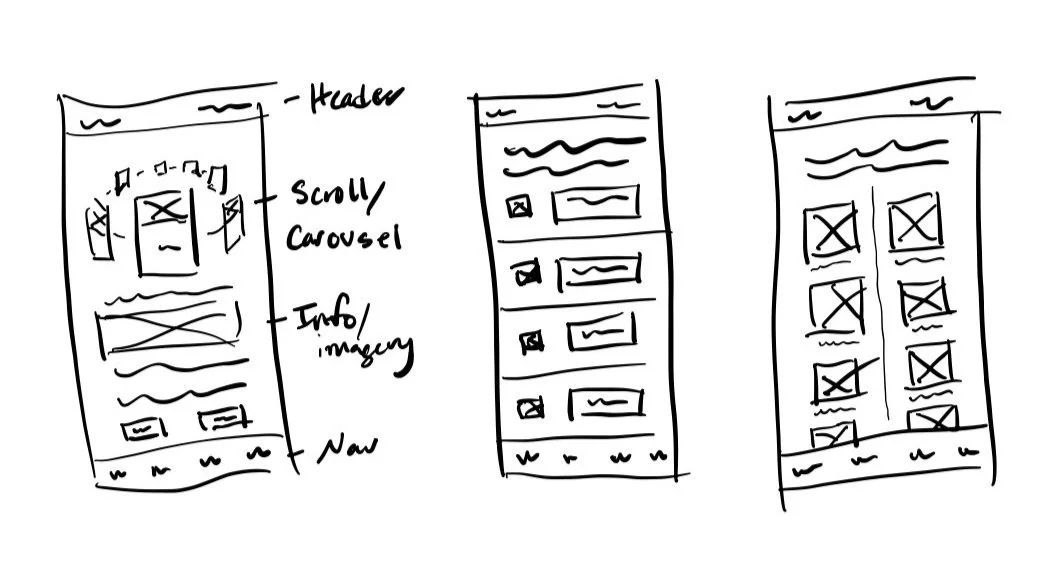
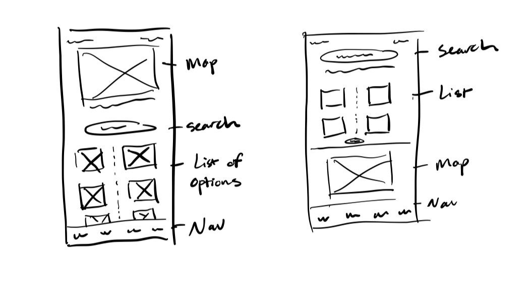
I started with building my key user frames to determine exactly what content would need to be included for optimal comprehension and design.
After refining the user journey, I started wireframing in Figma.
wireframES
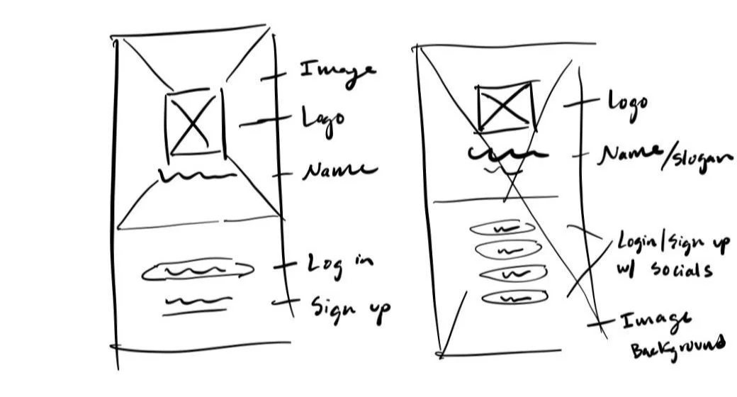
We created low-fidelity wireframes to begin envisioning how each task and user flow would operate.
LOGIN/SIGN-UP
Usability Testing
We had 5 participants test the functionality of our prototype with a moderator instructing them to either sign up, complete the tutorial, create a goal, or open the navigation and goal menus.
The participants were asked a series of questions to assess the effectiveness of the navigation and functionality of the features.
The responses to these questions were recorded, documented, and analyzed.
SEARCH/DISCOVER
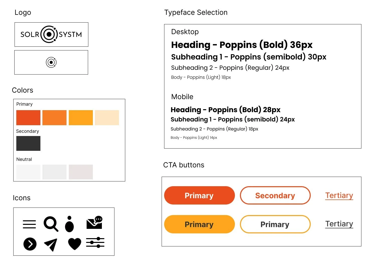
Then, we moved onto creating the mid-fidelity wireframe prototypes and creating UI components in alignment with the existing design system.
CORE VALUES:
Inclusive
Community
Engaging
Reliable
Friendly
Personable
4. Deliver
Interactive Prototype | Usability Testing | Prioritization | Iteration
HIGH FIDELITY - PROTOTYPES (with iteration)
Usability Testing - results
SUCCESS METRICS
Success/failure - 5/5 participants completed each task
Level of difficulty - 5/5 participants found the experience to be easy and user-friendly
Time Taken - 5/5 completed each task in under five minutes
RECCOMENDATIONS:
Search button/icon for clear direction to the search/discovery page
Specifics with wording and clear definitions of certain descriptions
UI features that help with directing users in the right directions
5. CONCLUSION
1) Solving even small problems can improve people's lives. It was nice to hear from my participants that the developed application will help new movers locate events faster and immerse them within social groups.
2) Make the user's life easier. The user experience has shown that even simple tasks like searching for an event online or editing an account can always be simplified to minimize the cognitive load on the user. When something works well, we don't even think about it.
3) Rapid iteration and validation encourage design learning. Conducting the iteration and testing allowed me to understand how testing my hypothesis and learning quickly can lead to effective improvement.
EVENT MATCHER/RANKINGS
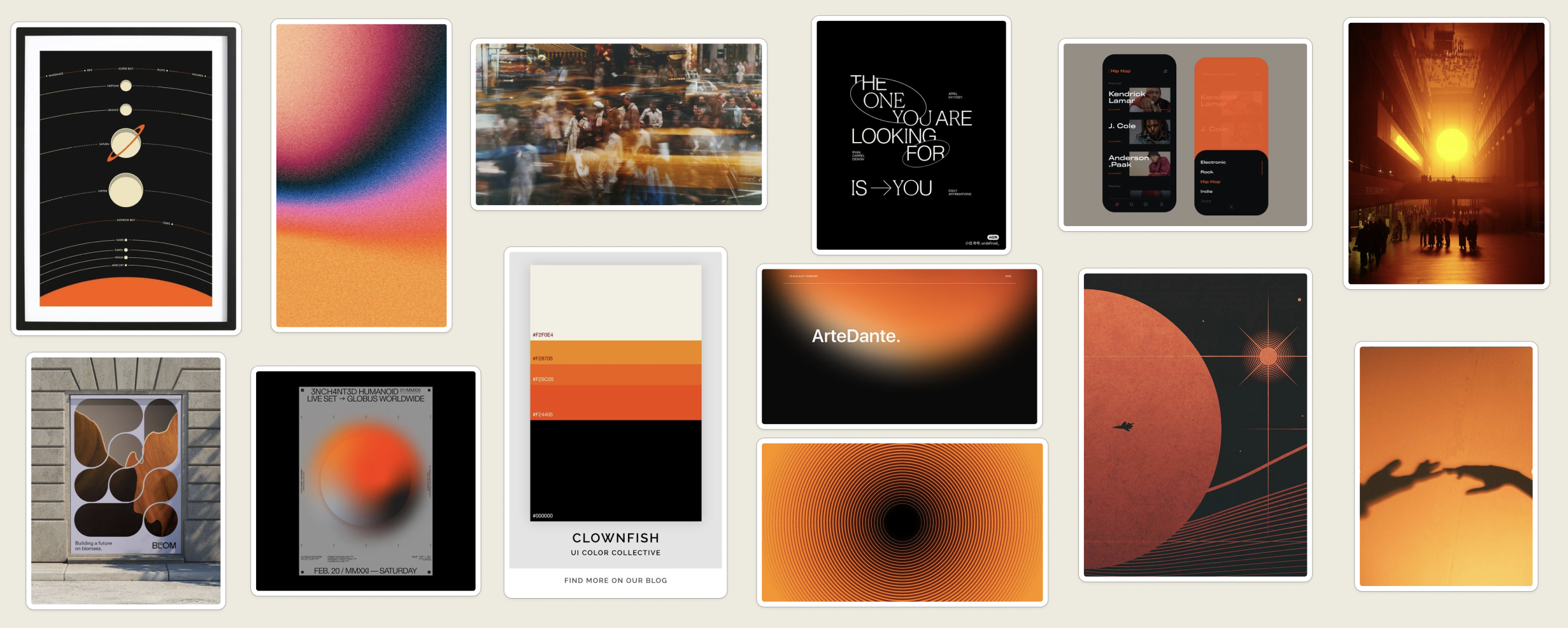
Moodboard/UI components
AESTHETIC:
Minimal
Creative
Inviting
Balanced
Modern
Edgy
